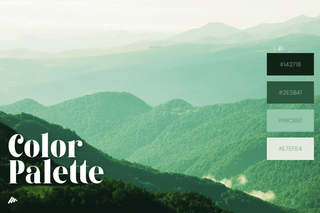
When it comes to designing a website, one crucial aspect to consider is the color scheme. Choosing the right colors can significantly impact how users interact with your site, influencing their emotions and driving website conversions.
Selecting the Perfect Color Palette Did you know that the color red is the most eye-catching of all? Or that yellow is easily visible from a distance? The goal is to guide your visitors’ eyes through your website’s colors strategically.
Let’s say you run a financial business. Opting for certain colors might make a huge difference in how your visitors perceive your brand. While a red base template might look appealing, it may lead users to associate your financial company with something entirely unrelated, like pizza, instead of focusing on setting up a retirement fund.
“So, should I go with green instead?” you might wonder. That’s a valid consideration, George. But remember, it’s crucial to choose the right shade of green and complementary colors. Will the photos match the base color? Are the highlighting colors in your text clashing with or complementing the design? Can users easily read the text against the background?
These are all essential questions to ponder when deciding on a color scheme. Using the wrong colors can undermine an otherwise professionally designed website.
Exploring Website Color Palettes In general, web design color palettes are broadly divided into three categories: Warm colors, Cool colors, and Neutral colors.

Warm Colors Warm colors have an exciting and invigorating effect on website users. Red, pink, yellow, orange, and gold fall into this category. When used alone, they might become overwhelming, so it’s best to combine them with subtler shades. Here are the various meanings associated with these warm colors:
- Red: Love, energy, passion, heat, anger, danger, and warning.
- Pink: Happiness, femininity, and sweetness, but can also be associated with immaturity and weakness.
- Yellow: Brightness, energy, happiness, but also cowardice and irresponsibility.
- Orange: Courage, confidence, warmth, sluggishness, and ignorance.
- Gold: Symbolizes wealth, prosperity, and greed.
Cool Colors Cool colors have a calming and soothing effect. Blue, purple, silver, and green are examples of cool colors. When used excessively on their own, they can make a website feel impersonal and dull. Combining a cool color with a warmer hue can produce excellent results. Here are the meanings associated with these cool colors:
- Blue: Tranquility, trust, and intelligence, but can also denote coldness and fear. It is often associated with masculinity.
- Green: Represents money, fertility, growth, and healing, but can also signify envy, greed, and jealousy.
- Purple: Symbolizes luxury, royalty, ambition, and mystery.
- Silver: Represents glamour, high technology, and sleekness.
Neutral Colors Common neutral colors include brown, black, tan, white, and grey. On their own, they might appear plain and uninspiring, but they are perfect for balancing the impact of other colors. The ideal website often incorporates neutral colors along with brighter ones.
Types of Website Color Schemes Website color schemes can be categorized as Monochromatic, Same Group, or Contrast.
Monochromatic: This scheme uses variations of a single color throughout the design, creating a classy look that works well for business websites. However, too much reliance on a single color can become monotonous, so consider incorporating neutral colors to add depth.
Same Group: In this scheme, two similar-looking colors are used together, such as blue and purple or red and orange. This combination can result in an elegant design without making the site feel repetitive.
Contrast: The contrast color scheme uses two completely opposite colors, like black and white, red and green, or blue and orange. While this can be attention-grabbing, too much contrast can be harsh on the eyes. To soften the effect, consider using a lighter shade of one color to complement the other.
Valuable Tips for Choosing Website Colors
- Avoid overly bold color schemes that distract users from your website’s content.
- Stick to the 256-color palette that web browsers can display to avoid dithering effects.
- Be cautious with attention-seeking colors like red and yellow, as excessive use can lead to eye fatigue.
- Ensure good color contrast between text and background for easy readability.
- Keep your website’s color scheme consistent throughout all pages.
- Consider your target audience’s age and preferences when selecting colors.
By implementing these pointers and carefully planning your website’s color scheme, you can create an elegant and delightful user experience that leaves a lasting positive impression.
